Thursday, January 31, 2013

Wednesday, January 30, 2013
Sitting in the square - Cosimo De Vita


The Italian artist Cosimo De Vita has realized a collection of chairs dedicated to four famous church and squares in the city of Florence: S. Spirito, S. Croce, S. Lorenzo and Santa Maria Novella. The collection is named Sitting in the square and it is actually exposed in Galleria CO2 via Mazzetta 10r, Firenze.

Tuesday, January 29, 2013
Life in Spiral by Hideaki Takayanagi - Photos by Takumi Ota


 |
| Photos by Takumi Ota |
Japanese architect Hideaki Takayanagi has designed the Life in Spiral house, located in Tokyo, Japan.
The main concept of the project is “a spiral porch in Tokyo” - read the interview to the architect by Holly on HomeDSGN.
I fell in love with the office room!
Monday, January 28, 2013


Saturday, January 26, 2013

Friday, January 25, 2013
A warm and pure Winter | Moodboard 25

Rosegold, cork and orange: little touches of color to warm a white winter.
01 : Rosegold Layla Headphones from nastygal.com
01 : Rosegold Layla Headphones from nastygal.com
03 : Image from Pinterest
Thursday, January 24, 2013
The Maryland - photographed by Phillip K Erickson


 |
| all images © Phillip K Erickson |
see also: City Home Collective
Wednesday, January 23, 2013
Lufdesign - Korea
"Lufdesign secures it own design with both fun and practicality simultaneously via observation of the surroundings and wants its pleasure and freedom from design process to be passed onto the users.
The new flow of information is like an air current. By this unilateral or bilateral air current, people can escape from the digitalized information and fulfill the desire to be out of civilization."
Nilfish, Lufdesign’s brand, is developing products through collaboration with rising designers from outside.
Following, some of Lufdesign genial products:
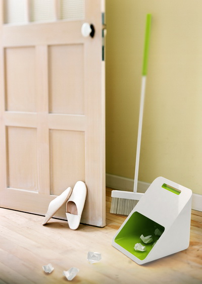

DustPan+Bin
"By morphing the function of the DustPan+Bin with that of the trash-can, a new hybrid is born: this DustPan+Bin that has a function, even when not in use, to put waste as a trashcan.
This DustPan+Bin seem like just DustPan, but it’s not only a DustPan but also trash can. It would be easier to sweep waste and dust. "


FlyingStick
"Just like a toy propeller, we make ‘Flying STICK’ flying by our hands.
We put the ‘Flying STICK’ between the palm of the hand and rub our hands, then ‘Flying STICK’ flies in the sky with the spin.
Most people who see the flying ‘Flying STICK’ want to catch the ‘Flying STICK’. So they probably run and jump to catch it.
‘Flying STICK’ has a camera at the bottom of the body. It can take a picture through being in the sky.
‘Flying STICK’ continuous takes a photograph from beginning to fly to landing in hand.
We discover our pure and natural smile using the ‘Flying STICK’."


"The Fork is a product that takes an everyday USB or mouse cable and transforms the appearance. Picture a messy plate of spaghetti neatly twisted onto a fork placed above a layer of cream sauce right before it is ready to be eaten. The Fork creates a similar picture with any cable.
With each item purchased, 'Save the Children' will be able to provide one meal for a child in hunger."


"The artificial cables all around us create a more dark and cold environment. The Leaf tie takes the cables and wraps the cables while bringing life to a dull area. It serves the dual purpose of design and efficiency."
http://lufdesign.blogspot.com
http://www.nilfish.com/
Tuesday, January 22, 2013
VIPP ANNUAL COLOUR 2013: RAY OF GREY

After a decade of exploring nuances from a vivacious colour palette, Vipp keeps it simple with a ‘Ray of Grey’.
The Vipp Annual Colour 2013 is a tribute to Vipp’s design philosophy of ‘form follows function’ resulting in a range of functional tools with a simple and pure aesthetic.
The Ray of Grey collection will be in stores from 1st of March 2013 as long as stock lasts.
“Good design never goes out of fashion”, Holger used to say. Time has proven him right; the Vipp bin has only been marginally improved since it saw the light of day back in 1939. Today the bin is internationally recognised as a design classic, and in November 2009 it was accepted into the architecture and design collection of The Museum of Modern Art (MoMA) in New York. Read the history here!

Monday, January 21, 2013
January: another sunday in Florence
 |
| Palazzo Strozzi, a new tent to cover the court |
 |
| Expo in Centro San Donato di Novoli, Firenze |
 |
| Expo in Centro San Donato di Novoli, Firenze |
 |
| Expo, piazza della Repubblica, Firenze |
 |
| Expo, piazza della Repubblica, Firenze |
 |
| Expo, piazza della Repubblica, Firenze |
 |
| La Rinascente shopwindow |
Saturday, January 19, 2013

Friday, January 18, 2013
Abbracciaio | Starck and Maggiar for Kartell

Abbracciaio is the new candle holder designed by Philippe Starck & Ambroise Maggiar and produced by Kartell. The name is the fusion of two Italian words that mean 'hug' and 'steel'. Infact, Abbracciaio is an aluminium casting of two shapes which are placed one in front of the other and linked in a loving embrace. Abbracciaio holds two candles and is made of polished aluminium in various colours.
With Abbracciaio, even candle holders are in love, Philippe Starck

.jpg)
Thursday, January 17, 2013
Small Sake | Klas Fahlén

Illustrator Klas Fahlén's - Agent Bauer - graphic work for Hong Kong based Sake brand 'Small Sake' . So nice!


Wednesday, January 16, 2013
Pantone Boutique Hotel Brussels - Michel Penneman + Olivier Hannaert


Welcome to the center of the color universe! Impeccably designed by Michel Penneman and Olivier Hannaert, The Pantone Hotel is in Brussels and it showcases the color of emotion with a distinctive hue on each colorous guest floor. From vivid to subdued, for business or leisure, our unique boutique design hotel perfectly suits your savvy palette and colorful imagination.
From a design perspective, The Pantone Hotel is built on an exceptional use of contrast; a white canvas provides clean space for saturated colors to pop. Guest rooms feature unique photography by esteemed Belgian photographer Victor Levy.


Pantone Boutique Hotel Brussels
1 Place Loix | 1060 Brussels - Belgium | Tel: +32 2 541 48 98
http://www.pantonehotel.com/
Subscribe to:
Posts (Atom)
LinkWithin
